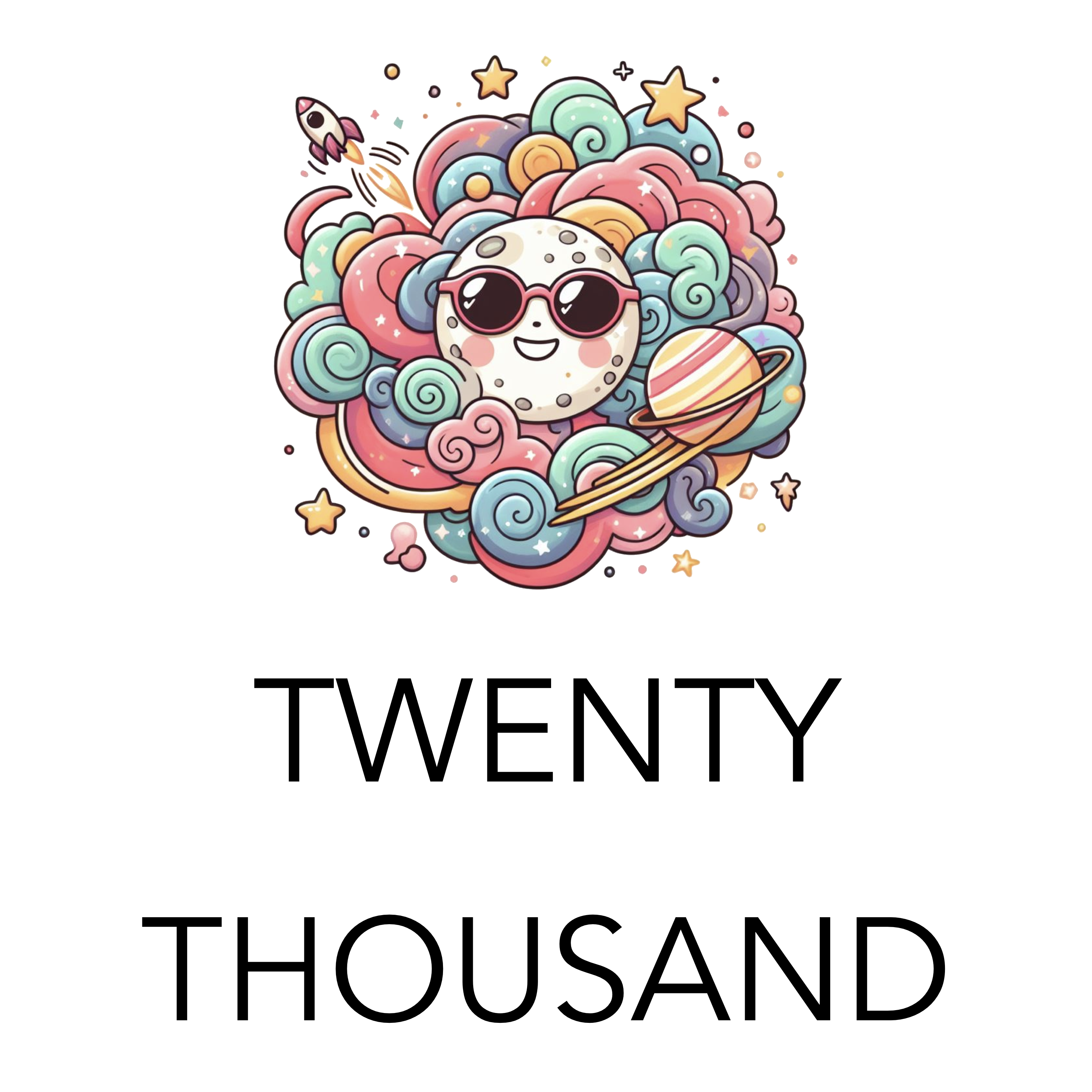
How To Design Podcast Cover Art
Did you know that most people decide whether or not to check out podcast based on the cover art alone? It’s true! Your podcast cover art is your first impression on potential listeners. That’s why creating eye-catching artwork that hooks people in and accurately represents your show is crucial.
How To Design Podcast Cover Art
Click here for my favorite way to make cover art
Design Tips for Effective Covers
- Keep it Simple: Don’t overcomplicate your design. A clear concept and uncluttered layout are best.
- Readable Fonts: Choose bold, easy-to-read fonts, especially for your podcast title. They need to be legible even at tiny sizes.
- Color is Key: Your color scheme should reflect your show’s mood (serious, lighthearted, etc.) and help you stand out in your genre.
- Use Relevant Imagery: A single graphic or photo can communicate a lot about your podcast’s theme.
- Consider AI Art Generators: Explore AI-powered tools like Bing Co-pilot for unique, customized visuals. These can generate images based on your descriptions, allowing further refinement to perfectly match your concept.
- Avoid Copyright Trouble: Use original graphics, commission them, or use royalty-free stock imagery.

Watch the video above to learn how to make simple podcast cover art using AI and my favorite image tool…
Podcast Cover Art Ideas
Click here for a podcast host that has a built-in cover art creator
- Visual Metaphors: Think of visual representations of your show’s themes.
- Example: A true crime podcast might use a magnifying glass over a fingerprint.
- Bold Typography: Your podcast title itself can be the artwork, with a carefully chosen font, stylized treatment, and a striking color against a simple background.
- Abstract Art: Consider colors, shapes, or patterns that evoke the mood of your podcast, even if they’re not directly representational.
- AI Assistance: Use tools like Bing Co-pilot to generate image ideas based on your descriptions. You can refine them to fit your vision.
3. Example Brainstorm
Let’s pretend your podcast is called “Mindful Moments” and it focuses on mindfulness practices and short guided meditations. Here are some ideas using different techniques:
- Visual Metaphor:
- A lotus flower in simple line art
- A tranquil landscape with soft colors
- A single candle flame against a dark background
- Bold Typography:
- “Mindful Moments” in a flowing, handwritten style
- The words stacked vertically with interesting spacing
- Abstract:
- A gradient of calming colors (blues, greens)
- A watercolor-like swirl with soft edges
Resources for DIY and Hiring Help
Click here for an amazing and easy to use image creation tool
- Design Tools:
- User-friendly tools like Canva, Adobe Express, or GIMP make it easy to create your own cover art, even with limited design experience.
- Snagit, on the other hand, is a screen capture and image editing software specifically designed to capture and annotate images on your computer screen. While it might have a bit steeper learning curve compared to the other tools mentioned, Snagit offers some unique advantages for creating podcast cover art:
- Precise Screen Captures: Snagit lets you capture that exact section with pixel-perfect precision if you want to incorporate a specific element from your computer screen into your cover art (like a unique chart or graph).
- Powerful Editing Tools: Snagit boasts a robust editing suite that allows you to add text, shapes, arrows, callouts, and other design elements to your captured image or imported background. You can also adjust colors, crop the image, and apply various effects to enhance your cover art.
- Workflow Integration: Snagit integrates seamlessly with other creative tools you might be using, like image editors like Photoshop or GIMP. This allows for a smooth workflow where you can capture your screen element in Snagit, edit it further in your preferred software, and bring it back into Snagit to finalize your cover art.
- Free Stock Images: Websites like Unsplash, Pexels, and Pixabay provide a massive selection of high-quality free images.
- Hiring Designers: If you want a custom design, sites like Fiverr, Upwork, or 99designs connect you with skilled freelance designers.
The Nitty-Gritty: Technical Requirements
- Dimensions:
- Apple Podcasts: Minimum 1400 x 1400 pixels, maximum 3000 x 3000 pixels
- Spotify: Recommended 3000 x 3000 pixels
- File Format: Save as JPEG or PNG.
- Color Space: Use RGB for the widest color compatibility.
Why Does Podcast Cover Art Matter?
- Discovery: When people browse podcast directories, they’re flooded with options. Compelling cover art makes your show stand out in a sea of thumbnails.
- Branding: A memorable cover helps people recognize your podcast instantly, building familiarity and creating a stronger brand identity.
- First Impressions: Your cover art’s visuals and style subtly hint at the tone and content of your podcast, influencing whether someone thinks it’s worth their time.
Free Reports
- Synology DS1525+ for Podcasters: What You Need to Know Before You Buy
- StreamYard Pricing (2026): Full Comparison of Plans, Differences, Features & Discounts
- SquadCast Pricing Explained: Every Plan, Feature, and Trade-Off Worth Knowing
- Zencastr Pricing Explained: Which Plan Actually Fits Your Podcast?
- Best Podcast Cameras in 2026: Creator Picks for Every Budget